
Colors in textiles deeply affect your mood and perceptions by conveying symbolic meanings and cultural messages. For instance, red can evoke passion or caution, while blue promotes trust and calmness. Bright hues energize you, whereas softer shades bring serenity. Your personal experiences and societal influences shape how you respond to colors. Understanding these psychological effects helps you choose fabrics that support your desired emotional impact—discover more ways color influences your mood as you explore further.
Key Takeaways
- Colors in textiles evoke specific emotional responses, such as calmness with blue or energy with red.
- Cultural meanings of colors influence how textiles are perceived and their mood impact across different audiences.
- Bright colors tend to energize and uplift, while subdued tones promote relaxation and serenity.
- Understanding color symbolism helps designers craft textiles that support desired emotional or behavioral responses.
- Personal experiences and societal contexts shape individual perceptions of textile colors and their mood effects.
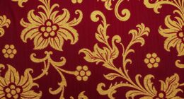
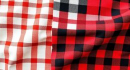
Color psychology plays a vital role in textiles, influencing how people perceive and feel about fabric choices. When you select fabrics for clothing, home decor, or accessories, you’re often unconsciously tapping into a complex web of color symbolism and cultural color meanings. These elements shape emotional responses and perceptions, making your choices more powerful than you might realize. For example, in many cultures, red is associated with passion, energy, and good luck, while in others, it may symbolize danger or warning. Understanding these cultural color meanings helps you communicate non-verbally through textiles, guaranteeing your message aligns with your intentions.
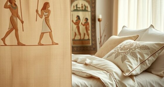
Color symbolism extends beyond individual feelings; it’s deeply rooted in cultural contexts. When you choose fabrics for a specific audience or setting, it’s essential to contemplate what certain colors represent in that culture. White, for instance, is often linked to purity and peace in Western traditions, making it popular for weddings and formal wear. Conversely, in some Asian cultures, white may be associated with mourning and funerals. Recognizing these differences allows you to craft textiles that resonate appropriately with diverse groups, avoiding unintended connotations. This awareness can influence everything from fashion design to interior decorating, where colors can impact the atmosphere and emotional tone of a space.
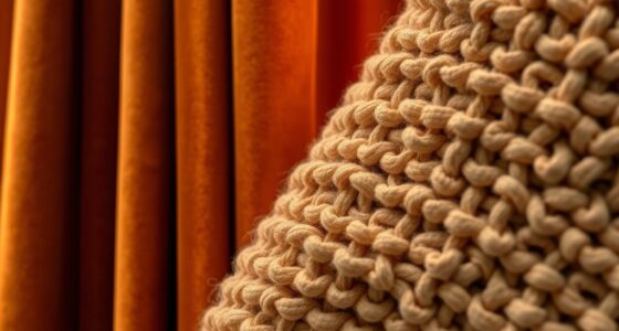
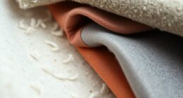
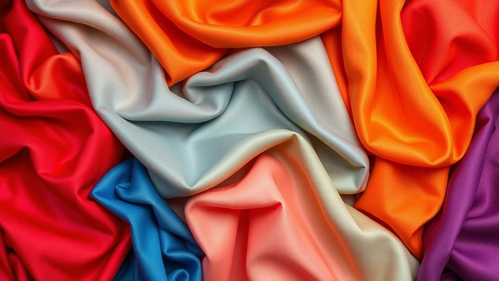
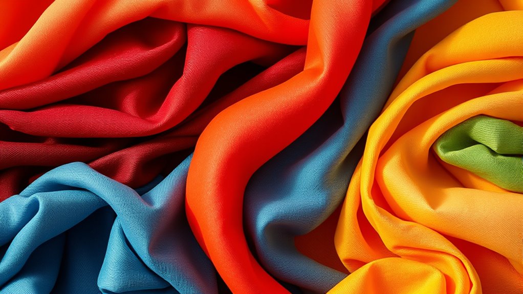
Your perception of colors is also shaped by personal experiences and societal influences, meaning the same shade can evoke different feelings in different people. Bright yellows might inspire optimism and happiness, but they can also feel overwhelming if used excessively. Deep blues often evoke calmness and trust, making them popular in corporate settings. When you understand the cultural and emotional implications tied to color symbolism, you can make more deliberate textile choices that evoke the desired mood. Whether aiming for vibrancy, serenity, or sophistication, your understanding of these nuances ensures your textiles communicate effectively.
In textiles, color psychology isn’t just about aesthetics; it’s a tool for influencing mood and behavior. By considering cultural color meanings and symbolism, you can select fabrics that support your goals—whether creating a lively, energetic space or a calming retreat. The power of color in textiles lies in its ability to subtly influence perceptions and emotions, often more than you realize. When you’re mindful of these psychological and cultural factors, your fabric choices become intentional, enhancing the overall impact of your designs. Additionally, awareness of affiliate marketing practices can help you select textiles and materials from trusted sources, ensuring quality and ethical considerations are met. Ultimately, understanding the depth of color symbolism helps you craft textiles that speak to your audience on a subconscious level, making your creations more meaningful and effective.
Frequently Asked Questions
How Do Cultural Differences Affect Color Perception in Textiles?
Cultural differences shape how you perceive colors in textiles through cultural symbolism and regional preferences. You might associate red with luck in China, while in Western cultures, it often symbolizes passion or danger. These varying perceptions influence your choices and interpretations of textile colors. Recognizing these cultural nuances helps you design or select textiles that resonate positively across different regions, respecting their unique symbolism and preferences.
Can Textile Color Choices Influence Consumer Purchasing Decisions?
Your textile color choices can considerably influence consumer purchasing decisions by leveraging color symbolism and current color preference trends. Bright, bold hues often attract attention and convey energy, encouraging impulse buys, while softer shades evoke calm, encouraging longer exploration. Staying updated on color trends helps you align your products with consumer preferences, increasing appeal. Thoughtful use of color symbolism in your textiles creates emotional connections, motivating customers to choose your products over competitors.
What Are the Latest Trends in Color Psychology for Textiles?
You’ll notice that the latest trends in color psychology for textiles focus on color symbolism and harmony to evoke specific emotions. Designers now prefer soothing, balanced palettes like pastel blues and earthy greens to promote calm and well-being. Bright, energetic hues such as reds and oranges are being used strategically to inspire enthusiasm. By understanding color symbolism and creating color harmony, you can craft textiles that resonate emotionally and enhance mood effectively.
How Do Environmental Factors Impact Textile Color Longevity?
Environmental factors like UV exposure and humidity effects markedly impact textile color longevity. UV rays break down dye molecules, causing colors to fade over time. High humidity promotes mold and mildew growth, which damages fibers and dulls colors. To preserve your textiles’ vibrant hues, protect them from direct sunlight and maintain proper humidity levels. Regular cleaning and using UV-resistant treatments can also extend the life of your fabrics’ colors.
Are There Specific Colors Best Suited for Therapeutic Textiles?
You should consider using calming colors like blue and green for therapeutic textiles, as they promote relaxation and reduce stress through their psychological effects. Soft pastel shades can also enhance comfort and healing. These colors are often used in color therapy because they help balance emotions and create a soothing environment. By choosing the right hues, you support mental well-being and foster a peaceful space for users.
Conclusion
Just like a painter chooses each hue to craft a masterpiece, you hold the power to influence moods through textile colors. Every shade you select becomes a brushstroke on the canvas of emotion, shaping how others feel and respond. Remember, colors are the silent melodies that sway our spirits—so choose wisely. By understanding this vibrant dance, you can turn your textiles into a symphony of feelings, creating environments that inspire, calm, or energize with every thread.