
Monochrome fabric inspiration for minimalist palettes allows you to create elegant, cohesive designs by focusing on subtle shade variations and refined textures. You’ll emphasize form, light, and surface finishes like matte, gloss, or satin to add depth without overwhelming the senses. This approach fosters a calming, sophisticated aesthetic that highlights the inherent beauty of each fabric. Keep exploring to discover how color, texture, and simplicity come together to elevate your designs seamlessly.
Key Takeaways
- Monochrome palettes emphasize subtle variations in shade and finish to create elegant, calming fabric designs.
- Focus on light interaction with matte, gloss, or satin textures enhances visual depth and rhythm.
- Simplified color schemes highlight texture, form, and surface details for a refined aesthetic.
- Using monochrome tones fosters cohesive, versatile collections with timeless appeal.
- Design principles prioritize subtlety and texture, elevating minimalist fabrics through deliberate, refined choices.
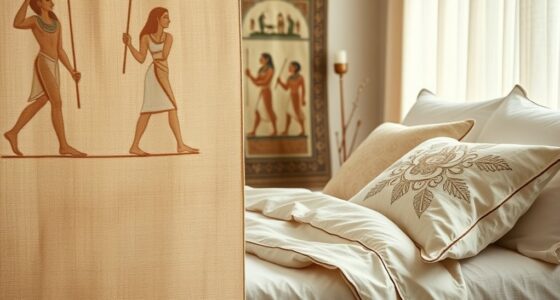
Minimalist palettes have gained popularity for their ability to create clean, calming, and visually striking designs. When exploring monochrome fabric inspiration, you harness the power of simplicity to evoke subtle elegance. Central to this approach is an understanding of color theory, which guides your choices in selecting shades, tones,, and textures that work harmoniously. By sticking to a single hue or variations of one color, you can craft a cohesive look that emphasizes form and texture without overwhelming the eye.
Embrace monochrome simplicity to create cohesive, elegant textiles that highlight form, texture, and subtle beauty through color harmony.
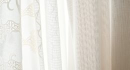
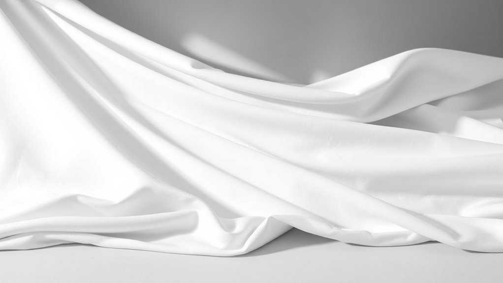
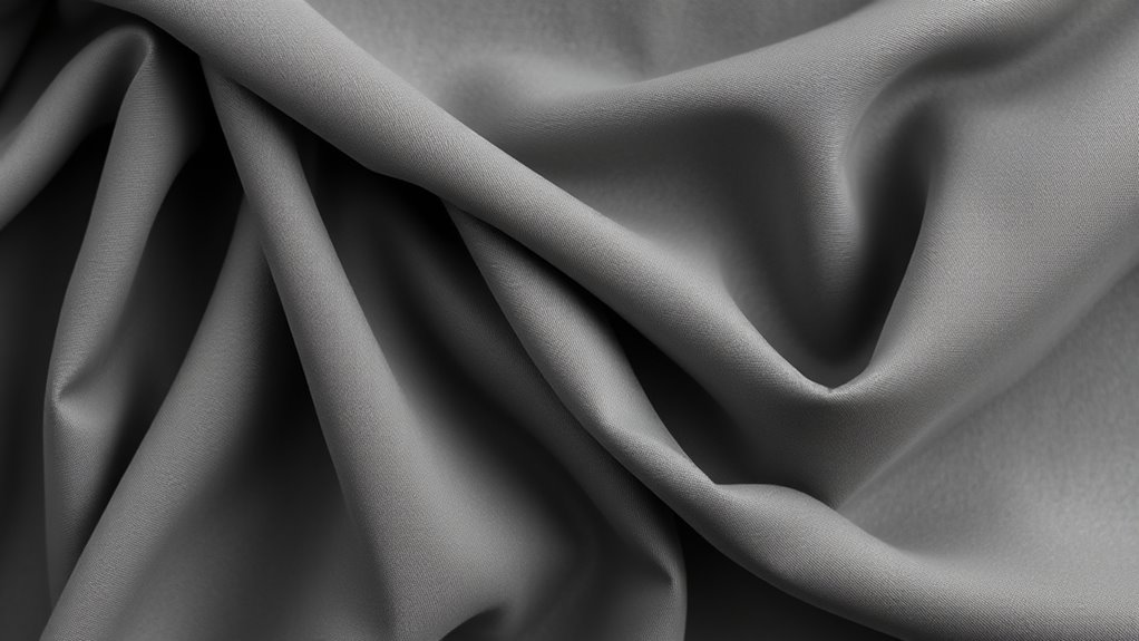
Using monochrome palettes allows you to focus on the nuances of design simplicity. Instead of cluttering your fabric with multiple colors, you highlight the material’s inherent beauty through variations in shade and finish. This approach makes each piece feel deliberate and refined. When selecting fabrics, pay attention to how light interacts with the material — matte, gloss, or satin finishes can add depth and interest even within a limited color range. Your goal is to create a visual rhythm where the eye moves smoothly across the fabric, appreciating the subtle differences in tone. Additionally, understanding how individual responses to color vary can help tailor designs to evoke specific emotions or atmospheres.
Color theory plays a essential role in monochrome design. For example, choosing a cool palette of blues can evoke tranquility, while warm shades like ochre or rust might generate warmth and comfort. When working within a monochrome scheme, consider the emotional impact of your chosen hue and how it complements the space or purpose of your design. By understanding how different shades relate to each other, you can build a layered, textured look that remains unified and balanced. The goal is to translate complex emotions or ideas through a single, consistent color, making your fabric design both sophisticated and accessible.
Design simplicity isn’t just about minimizing colors; it’s about maximizing the impact of each element. With monochrome palettes, every stitch, fold, and texture becomes more meaningful. You can experiment with different weaves, embroidery, or surface treatments to add visual interest without complicating the color scheme. This restraint pushes you to think more critically about composition and detail, resulting in a more intentional and polished final product. Moreover, embracing minimalist design principles can help you develop a more refined aesthetic that remains versatile over time.
Ultimately, monochrome fabric inspiration rooted in minimalist palettes encourages you to embrace subtlety and elegance. It challenges you to see beauty in restraint, leveraging color theory and design simplicity to create textiles that are both timeless and modern. By focusing on tone, texture, and nuance, you craft pieces that speak volumes through their understated sophistication. This approach not only simplifies your creative process but also elevates your designs, making them versatile and enduring.
Frequently Asked Questions
How Do I Choose the Right Monochrome Fabric for My Project?
To choose the right monochrome fabric for your project, start by considering your color coordination goals and the mood you want to set. Opt for fabrics with different textures—like matte, shiny, or woven—to add depth even within a limited palette. Test swatches in your space to see how they interact with light and other materials. Trust your instincts and select a fabric that complements your overall design vision.
What Techniques Enhance the Depth of Monochrome Fabric Designs?
Imagine you’re a renaissance painter mastering chiaroscuro; you can enhance depth by using texture layering and tonal variations. Incorporate subtle differences in fabric texture, like matte versus glossy finishes, and vary shades within the same color to create visual interest. These techniques play with light and shadow, giving your monochrome design a dynamic, multi-dimensional feel that captivates the eye and adds sophistication to your project.
Are There Specific Fabrics Best Suited for Minimalist Palettes?
You should choose fabrics with smooth textures, like silk or fine cotton, to maintain a minimalist look. These fabrics guarantee consistent color absorption, giving you uniform color consistency across your design. Avoid heavily textured or glossy fabrics, as they can disrupt the clean, simple aesthetic. By selecting fabrics with a sleek texture and reliable color, you’ll achieve a cohesive, refined monochrome palette that emphasizes subtlety and elegance.
How Can Monochrome Fabrics Be Combined With Other Design Elements?
You can definitely combine monochrome fabrics with other design elements by exploring contrast pairing and texture mixing. For example, pair smooth, matte fabrics with glossy or textured materials to create visual interest. Incorporate varied textures like linen, silk, or wool to add depth. This approach proves that monochrome doesn’t mean boring; it’s about balancing contrast and tactile variety to elevate your overall design.
What Are Common Mistakes to Avoid in Monochrome Fabric Selection?
You should avoid poor color matching and clashing shades, which can make your monochrome palette look dull or chaotic. Be mindful of fabric texture; mixing overly similar textures can flatten the design, while combining varied textures adds depth. Steer clear of choosing fabrics that don’t complement each other, and always test your selections in different lighting to guarantee cohesion and harmony across your monochrome scheme.
Conclusion
So, why not embrace the simplicity of monochrome fabrics in your next project? Minimalist palettes can transform your space or wardrobe with just a few thoughtfully chosen shades. They encourage you to focus on textures and subtle details, making everything feel more intentional. Are you ready to experiment with monochrome and discover the beauty in understated elegance? Sometimes, less truly is more, and these palettes are your perfect starting point.